Queencard: A Handwritten Font That Makes Your Campaigns Instantly Recognizable
It was 7:42 a.m., and I was squinting at my phone screen—zoomed in on a YouTube thumbnail I’d just mocked up for a client’s new workshop series. The headline read “Your First 30 Days Launching Online.” But something felt off. Flat. Generic. Like it could belong to any creator, anywhere. I swapped fonts three times—clean sans serifs, bold display fonts, even a playful script—but none carried the warmth, intention, or quiet confidence the message deserved. Then I opened Queencard.
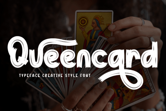
Within seconds, the headline transformed—not with flash, but with presence. Queencard is a premium handwritten font from the Script Amp collection, designed not for ornamentation, but for resonance. Every letter has subtle variation in stroke weight, natural entry/exit flourishes, and a gentle rhythm that feels human—not traced, not templated, but *written*. It’s elegant without being fussy, approachable without sacrificing distinction. Think of it as the kind of handwriting you’d see on a carefully chosen gift tag, a boutique storefront sign, or a heartfelt note tucked into a product box.
We used Queencard across six touchpoints for that workshop launch: Instagram carousel headers, Pinterest quote pins, email banner text, YouTube thumbnail titles, Reels cover overlays, and the hero section of the landing page. In each case, it did one thing consistently: clarified intent. Not by shouting, but by signaling care. When paired with a clean, neutral sans serif (we used Inter Light for body copy), Queencard became the visual voice—the “speaker” in the room—while supporting type handled information flow. That contrast created instant hierarchy: your eye lands first on the Queencard phrase (“Start Small. Stay Consistent.”), then flows naturally into the details.
Queencard shines brightest where attention is fleeting and context is visual. On Instagram feeds, its organic curves hold up beautifully—even at small sizes—because the letterforms are open, legible, and generously spaced. No tight counters or fragile terminals that vanish on mobile previews. On dark-mode thumbnails? It pops with soft contrast, especially when set in white or warm cream with a subtle drop shadow. On light backgrounds, it reads cleanly without needing heavy outlines or fills. We tested it over textured photo overlays (a common need for lifestyle brands) and found that its confident stroke weight kept it readable without competing visually.
Here’s what we learned about where Queencard works best—and where to pause:
- Perfect for: Short headlines, logo-style wordmarks, campaign labels (“Spring Edit”, “Founders’ Circle”, “Live Workshop”), quote graphics, email subject line previews, Reels covers, and branded content series titles.
- Less ideal for: Long paragraphs, dense pricing tables, or legal disclaimers—this is a display font, not a workhorse text face.
- Smart pairing: Inter, Poppins, or Lato for clean contrast; Playfair Display for editorial depth; or even a second, simpler handwritten font (like a monoline script) for layered accents—just avoid competing scripts.
We also dug into the file package before going live. Queencard includes OpenType features like stylistic alternates and ligatures—small but meaningful touches. For example, the “&” and “ff” combinations have custom-connected forms that feel intentional, not automated. It supports Latin-based languages (English, Spanish, French, Portuguese), and comes in both .OTF and .TTF formats—critical when building templates for Canva, Figma, or Adobe Creative Cloud. And yes—we double-checked the commercial license: it’s cleared for use in client campaigns, digital ads, merch mockups, and even SaaS dashboard UIs where branding extends beyond static graphics.
One real moment that stuck: designing a set of Pinterest pins for a small-batch tea brand’s holiday campaign. Their previous graphics used a generic brush script that blurred into the background of feed scrolls. With Queencard, the phrase “Hand-Picked. Slow-Steeped.” stood out immediately—not because it was bigger, but because its personality anchored the composition. Followers paused longer. Comments included “This font feels like the brand,” which, honestly? That’s the goal. Typography isn’t decoration—it’s tonal infrastructure. Queencard gives your messaging texture, memory, and emotional precision.
It’s also surprisingly versatile across seasonal and thematic shifts. We reused it for a minimalist webinar banner (“Ask Me Anything: Building With Integrity”) and later adapted it for a vibrant online shop promotion (“Flash Sale: 24 Hours Only”). Same font. Different moods—achieved through spacing, color, size, and surrounding design choices—not font switching. That consistency builds recognition faster than you’d expect. When audiences start associating that graceful “Q”, the tapered “g”, or the looping “y” with your brand’s voice, you’ve crossed into true identity territory.
Before finalizing any campaign asset, we always test Queencard in three ways: first, on an iPhone screen at 50% zoom (to simulate fast-scrolling); second, as a 120×120px thumbnail (the size many platforms render previews); third, overlaid on both light and dark photo backgrounds with 10% opacity reduction—just to confirm readability holds under real-world conditions. It passed every time.
If you’re choosing a font for your next campaign, ask yourself: does it help people *feel* the message before they finish reading it? Does it make your brand sound like someone worth listening to—not just another notification? Queencard doesn’t solve strategy, but it elevates execution in ways that compound: sharper thumbnails, more memorable quotes, stronger logo treatments, and visuals that quietly say, “We made this with care.” That kind of clarity doesn’t come from trends. It comes from thoughtful typography—and Queencard delivers it, reliably, every single time.